Black Diamond – The Focus
The focus of this project is to Reverse Engineer any advertisement, meaning analyzing certain design aspects and principles such as contrast, repetition, alignment, proximity and color. After doing so, analyze the same design aspects in the new advertisement created to fit in the same campaign as the original.
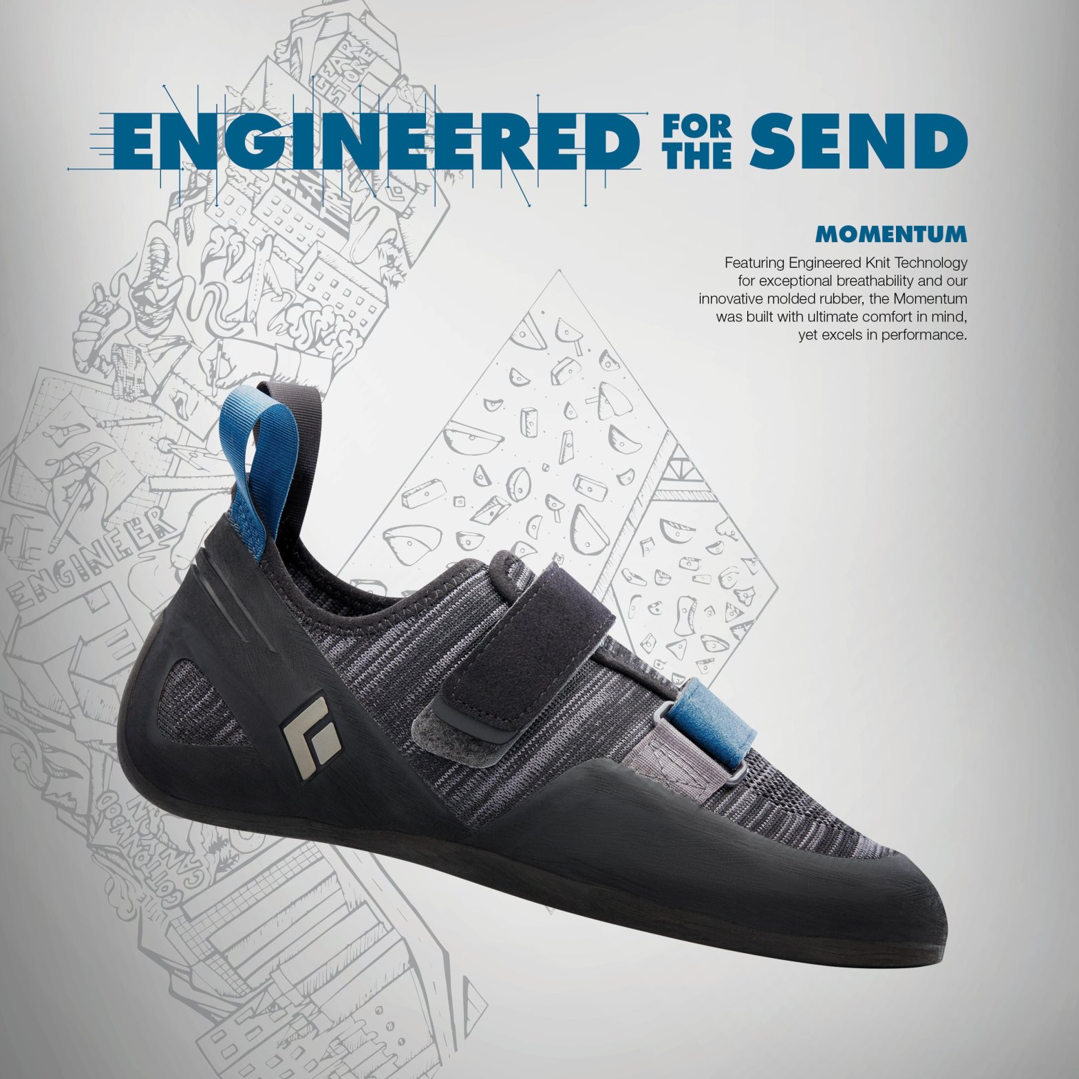
This advertisement is a targeted campaign for Black Diamond (Rock Climbing/Outdoor Equipment & Apparel Company) and their new line of Momentum Climbing shoes. The designer is unknown but can be found on the Ascent Outdoors website under their News page. https://ascentoutdoors.com/blogs/news/black-diamond-climbing-shoes

Original Ad Analysis – Design
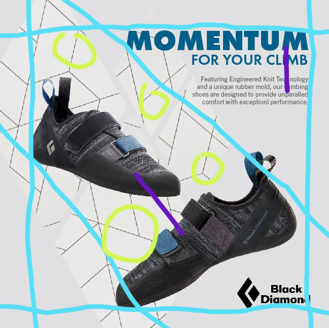
In this original Black Diamond climbing shoe advertisement we can see that there were multiple design principles used throughout to enhance their message and design.
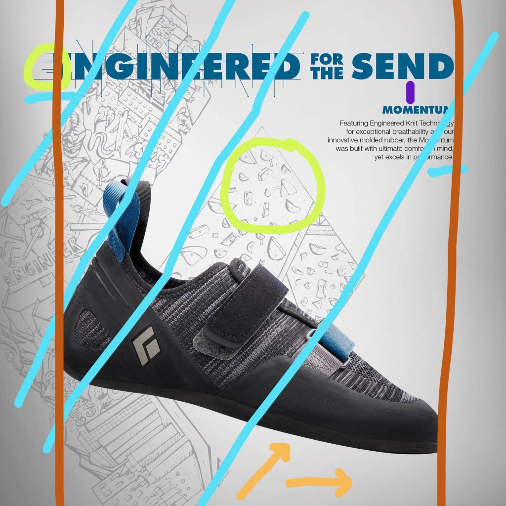
Shown in orange, the arrows at the bottom of the image shows the contrast between the the main image, the shoe, and the background which is a lighter gray with a gradient. Then in the green circles we can recognize the repetition within the design, in the type there are multiple areas of lines coming off of it, then in the background there is repetition in the holds of the rock wall sketch. Then alignment is demonstrated with he blue lines, where the background images aligns with the shoe image in the front keeping everything flow visually. Another use of alignment can be seen in the dark orange/red lines on either side keeping the text and the shoe in the center of the page. Finally we can see that there is proximity in the placement of the text, shown in purple.
Original Ad Analysis – Color & Typography
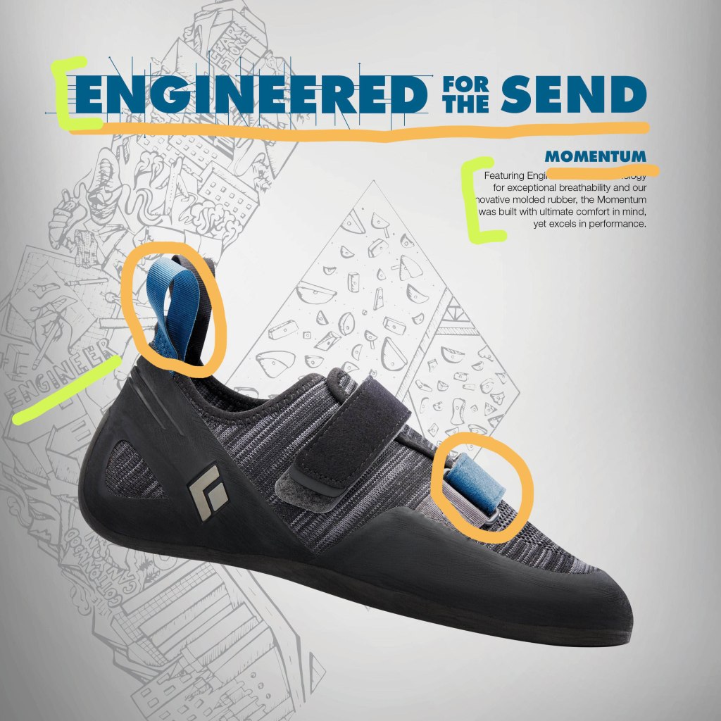
Other aspects of design include color and typography, in this design we can see that both aspects were utilized. In the orange we can see that the same blue shades/family were used in the text and in the shoe, these accents of blue really stand out compared to the neutral background and black shoe. Then for the typography we can see this in the green strokes above, the text is very block like and bold just like rocks would be, using serif fonts to show that. Then we can see that the text was also captured in the background image on the left, shown those block letter once again.
Black Diamond – New Advertisement
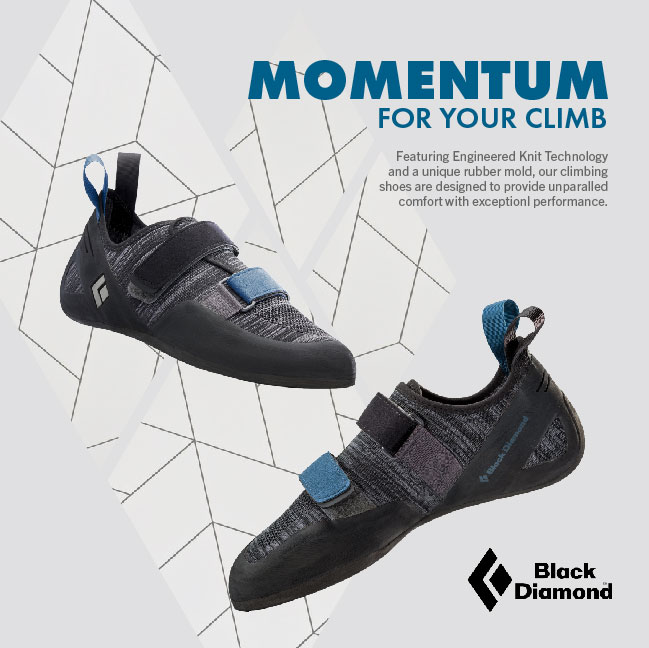
New Ad Analysis – Design
More of the same design principles can be found in this new ad as in the original. In the blue lines we can see the vertical and horizontal blue lines that show a consistent boarder as well as the diagonal lines keeping the shoes and logo in line. The green circles help us see the repetition of the background, through its lines and the diamond shapes, which the diamonds can also be seen in the logos. Finally proximity can be seen in purple,
New Ad Analysis – Color & Typography
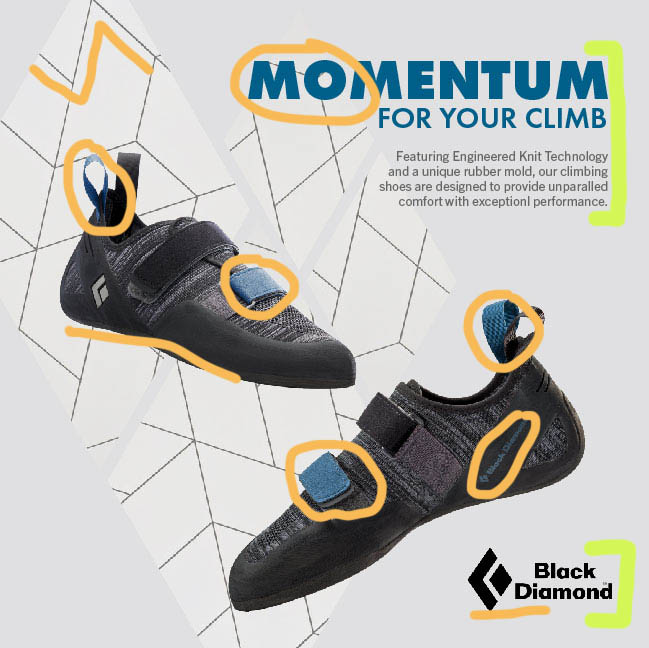
In the newly created ad, we can see the same color scheme used and in a way to create unity between the type and the shoes (shown in the orange circles), keeping it minimalistic. Then we can see more color through the black logo and the black geometric lines (shown by the orange lines). In the green brackets we can again see the same block letters as in the original advertisement.
Black Diamond – The Wrap-up
These advertisement makes great use of all the listed design principles; contrast, repetition, alignment, proximity and color. By focusing on multiple design principles they are able to keep the viewers eyes moving across the image, without feeling overwhelmed or confused. The ads have a cohesive color scheme to help you recognize that they are for he same campaign, as well as the same text to help it be easily recognizable again. The designers concept is clearly portrayed, showing how their new Momentum shoes are sleek but ready for the climb.
