
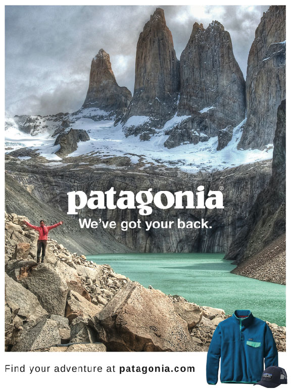
Patagonia – The Focus
The focus of this project is to Reverse Engineer any advertisement, meaning analyzing certain design aspects and principles such as contrast, repetition, alignment, proximity and color.
This advertisement is a general campaign for Patagonia, the designer is Jacob McCarter, https://www.behance.net/gallery/65530047/Patagonia-Ads.
Patagonia – Contrast
In this advertisement the designer uses the landscape in the picture to depict the design principle of contrast, which helps move your eyes around the whole poster because there are not only color differences between the highlighted areas but in texture as well. Using this design principle really helps show the different aspects of nature and adventure that they want their customers to explore in their clothing and apparel.
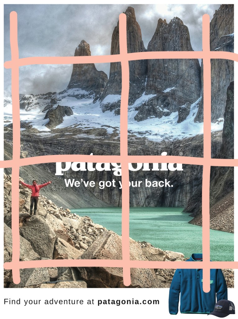
Patagonia – Repetition
In this poster there is a lot of repetition used with their company name. Their name is not only used as text but also on their appeal in the corner as well. By having their name take up most of the text, the designer can make a closer association of their company with the outdoors.
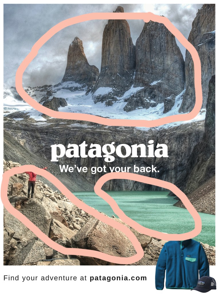
Patagonia – Alignment
This advertisement has great use of alignment by breaking up the picture into three main sections both vertically and horizontally. Vertically we can see that the person, their name and tagline, and then their apparel are are the main points, which keeps the focus on their brand. Horizontally there is the use of the scenery with the mountain peak up top, their brand in the center, and the rocks down below, while the bottom portion ties everything together.
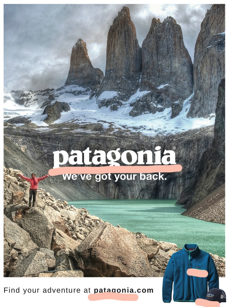
Patagonia – Proximity
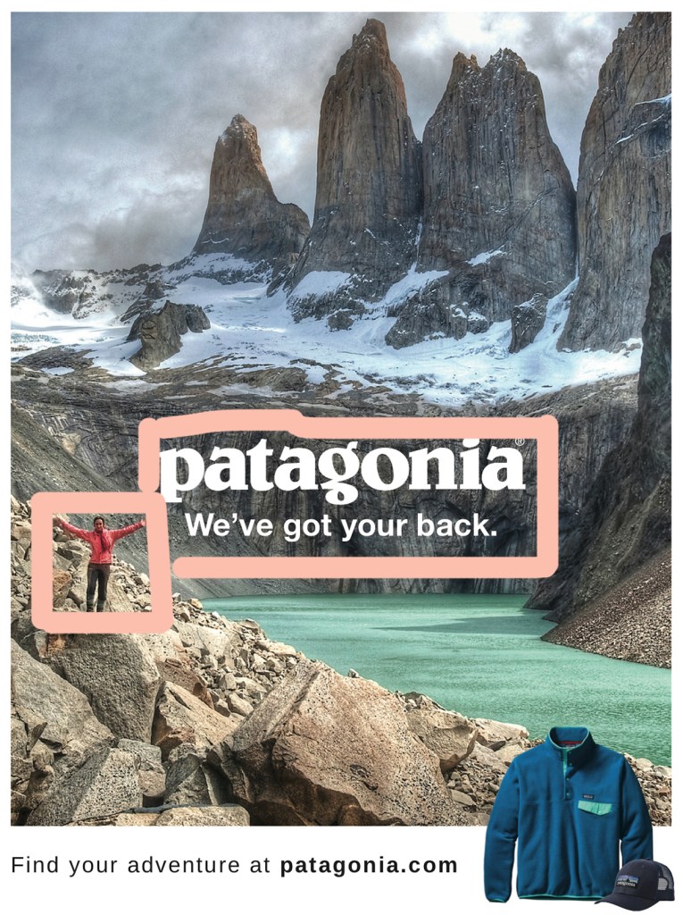
Proximity is used in this picture by placing the brand name and tagline next to the person, this helps represent that the clothes the individual is wearing are the Patagonia apparel. Another use of proximity is the person is standing where the brand, water, rocks and mountains all meet, showing that they can cover all aspects of adventure and the outdoors.
Patagonia – Color

Color plays a big role in this design because the scenery has neutral colors for the most part, and the text is only displayed in white or black. The main pops of color come from their product and apparel. The use of color is also not concentrated in a single section, which helps represent how you can take the clothes anywhere.
Patagonia – The Wrap-Up
This advertisement makes great use of all the listed design principles; contrast, repetition, alignment, proximity and color. By focusing on multiple design principles they are able to keep the viewers eyes moving across the image, without feeling overwhelmed or confused. The designers concept is clearly portrayed, showing how their apparel can be taken anywhere and that you can rely on them to take the adventures you want in the way you want.
