Design Spread – The Focus
The focus of this project is to Reverse Engineer any advertisement, meaning analyzing certain design aspects and principles such as typography and photography.
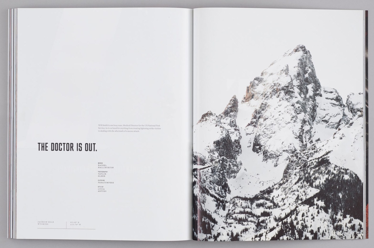
This magazine design spread is from Issue 6 of Avaunt Magazine. The designer of this spread is Taylor Glenn, and the spread can be found on the following sites, https://blog.at-edge.com/taylor-glenns-work-for-avaunt-magazine/ and https://avauntmagazine.com/shop/.
Design Spread – Category of Typefaces
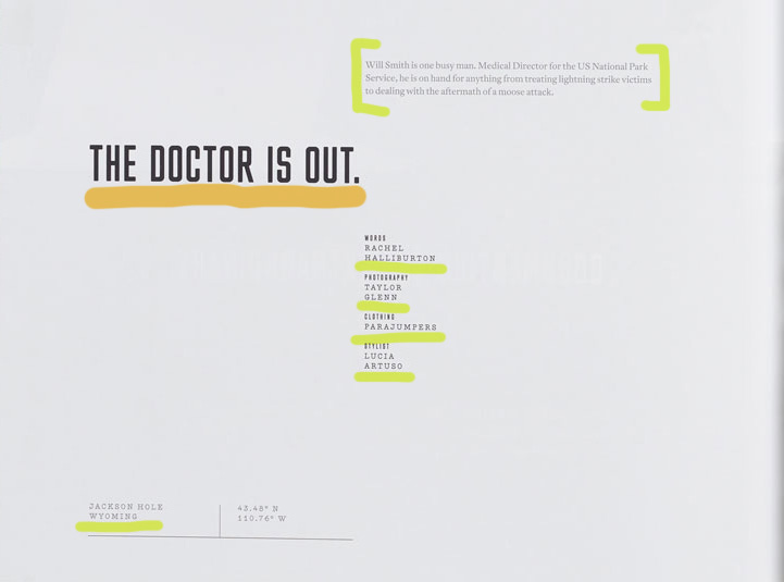
The are multiple categories of typefaces represented in this design spread. The category of typeface underlined in orange would be considered a Sans Serif Type Style, specifically “Square”. This type can be identified through its grotesque character traits and proportions, dramatic squaring of normally curved strokes. As well as the more latitude in character, which tend to be limited to display designs like above. Some fonts of the Sans Serif Type Style – Square can include Cachet and Neo Sans.
The category typeface underlines in green can be identified as a Serif Type Style, more distinctly as “Traditional Serifs”. Some indicators of the traditional serifs are the finer character strokes, which can be reproduced and have a subtler character shape to be maintained. The axis of curve strokes can be inclined in transitional designs, and the strokes have a vertical stress. Some fonts of the Serif Type Style – Traditional Serif can include Baskerville and Perpetua.
Design Spread – Contrast of Typefaces
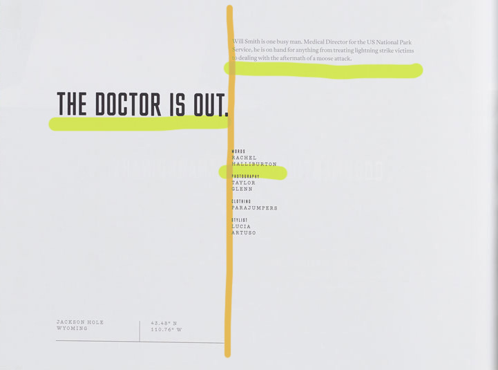
In this design spread we can see the contrast between the fonts on the page through the different strokes of each section of type (illustrated in green above). This allows for certain text to stand out first which creates visual hierarchy for the viewer, something that supports this idea is the point size of the type because it elevates the strokes. An additional way that the typefaces are contrasted with one another are where they are placed on the page (illustrated in orange above). There is a distinct line that separates the different text on the page through the design principle of alignment, creating a certain flow.
Design Spread – Photography Utilization
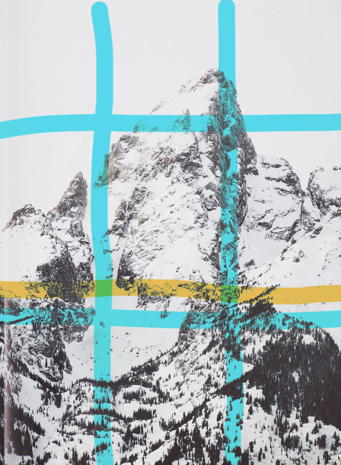
In this image used in the design spread we can see that there is a clear-cut focal point, but there is so much more going on in this photo. The photographer of the photo applied the rule of thirds by making the peak on the mountain in the top right corner of where the lines intersect, which is highlighted with the blue lines above. Then there is a definite leading line highlighted in orange above, this is where the tree line stops, and where the color change occurs causing more white from snow to show since there is no more trees adding contrast.
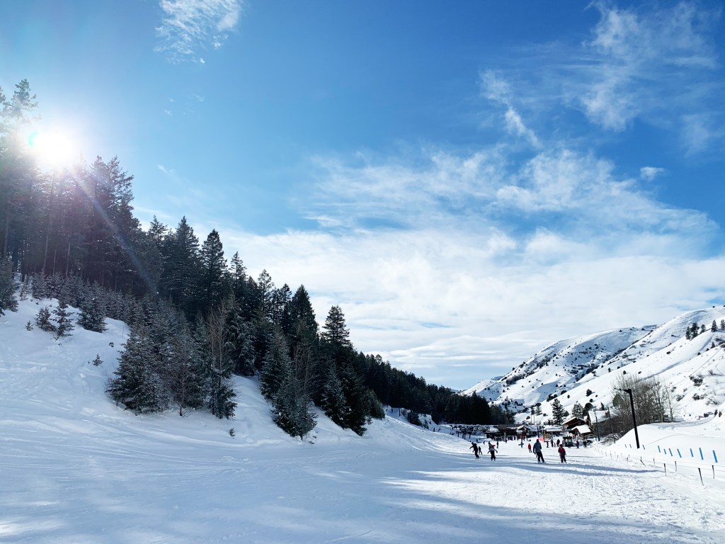
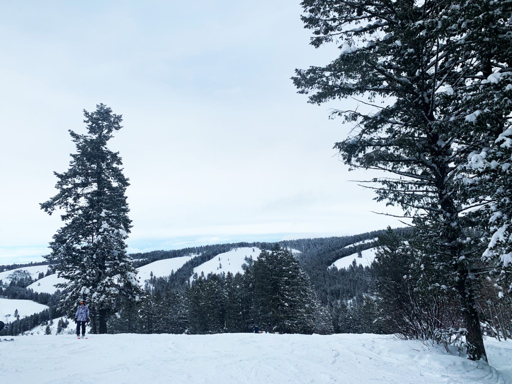
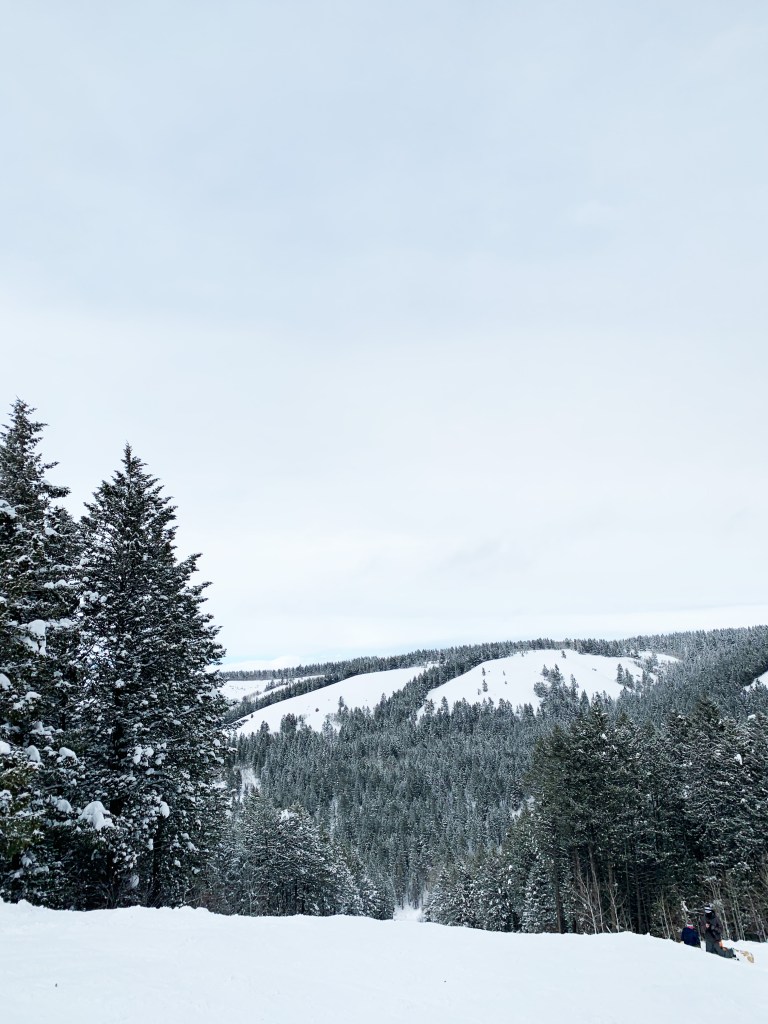
Design Spread – New Photography
My three images that I took were at Kelly Canyon Ski Resort, and have a similar feel to the photo used in the design spread by Taylor Glenn. These images use consistent colors and environment, but more importantly they follow the rule of thirds. In the first image where the tree line and the mountain side on the right meet is at an intersection of the third lines, this idea also goes for the other two pictures but where the main trees are. Then all three images utilize leading lines, primarily where the ridges meet the skyline, and where the standalone trees are showing in the skyline.
Design Spread – The Final Cover
This magazine design spread created by designer Taylor Glenn for Issue 6 of Avaunt Magazine, has optimal use of the different categories of typefaces through using more than one and then contrasting them with one another by placement on the page, stroke thickness as well as point size, which are all contributing factors. All of these concepts were executed in a sleek manner, because nothing feels crowded, awkward or out of place making the design appealing to the eye. By adding the photo on the other page it gives it a dramatic feel especially because the image is elevated through the great use of the Rule of Thirds and Leading Lines.
