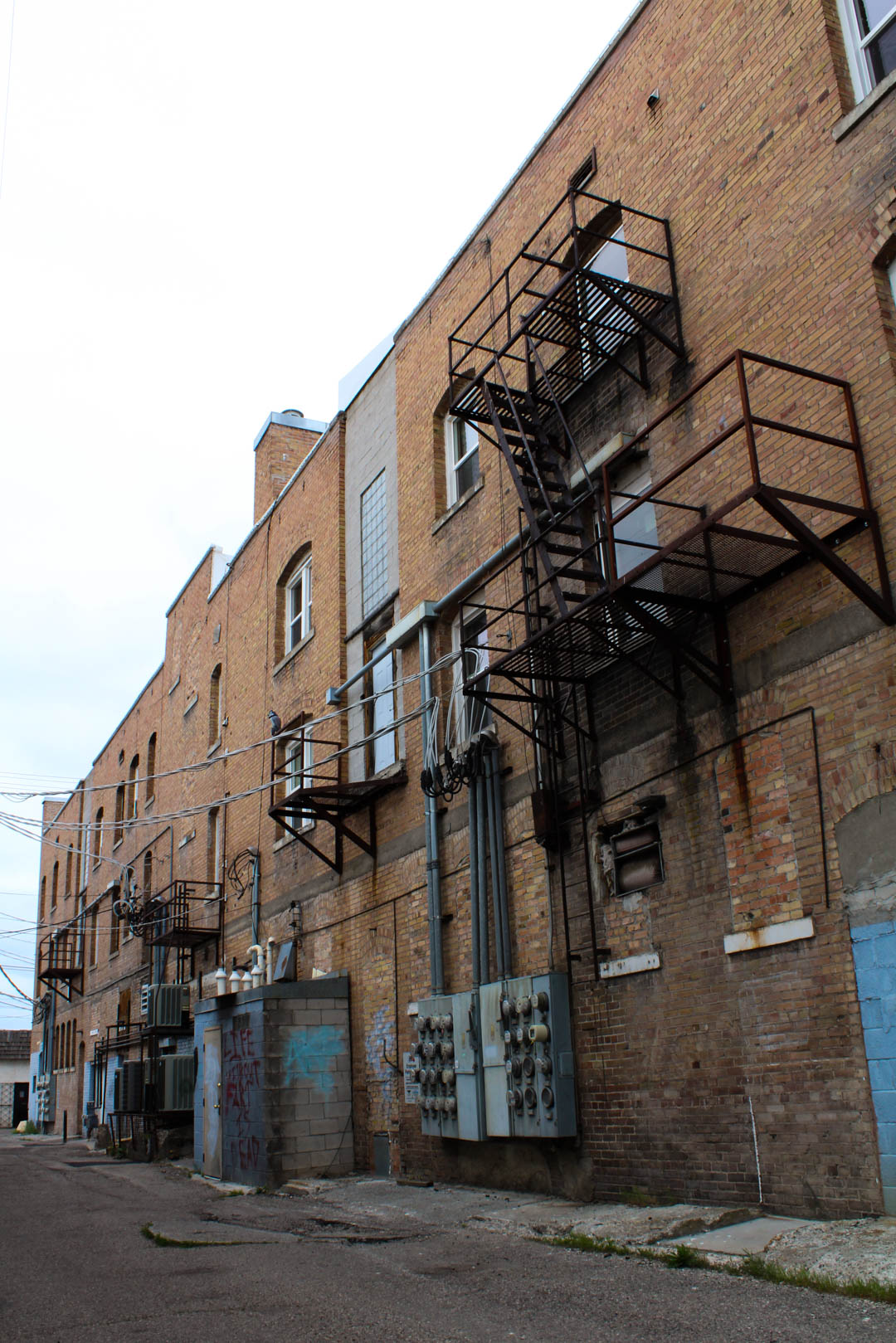
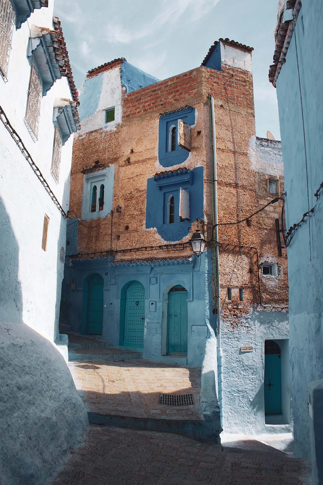
– BACK ALLEY: For this image I wanted to shoot some older buildings around Rexburg, ID but opted for the backside of them. Even though it was cloudy outside I was still able to use a lower ISO of 200 because I utilized my tripod. In post, I brought out the colors of the paint and the bricks in Adobe Lightroom.
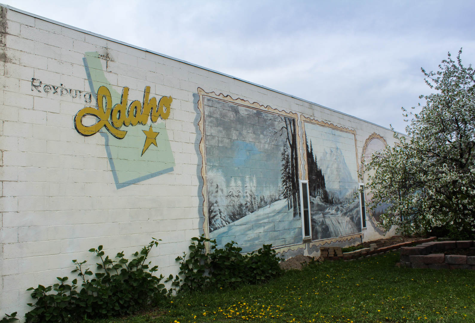
– REXBURG ART: I had seen this wall in Rexburg, ID before but thought it would be a great idea to shoot it for this assignment. I used a tripod while taking this photo as well, which again helped me to keep a lower ISO at 200. In post, I brought out the colors of the paint, and slightly darkened the sky so it wasn’t so washed out and too bright.
-PV: This is a photo of a guitar tube amp taken in my apartment. I wanted to experiment with using an object/subject that can be in focus and part of it out of focus. I think that having the focus fade out helped elevate the volume knob. In post, I changed the temperature to a warm color in Adobe Lightroom.
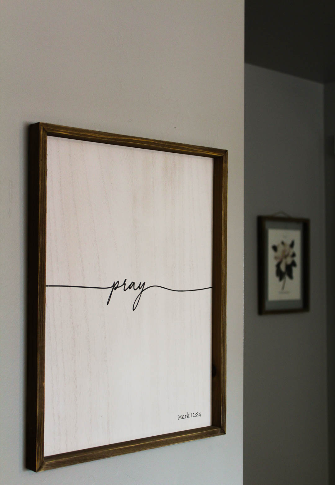
– PRAY: I thought this had an interesting angle because the frames were on two separate walls, which also had contrast in light and color. This helped the frame that was in focus stand out more. In post, I lightened the white and made it a warmer tone in Adobe Lightroom.
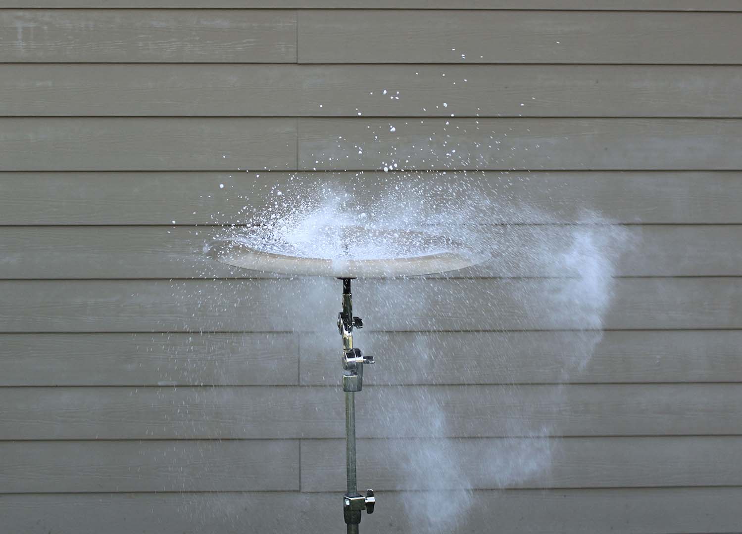
– SOUND CAPTURED: For this image I wanted to try something a little different so I used a china cymbal and placed chalk on the top of it. In order to capture this image I needed a tripod, a fast shutter speed, and a wide aperture. I then had my husband hit the cymbal causing the chalk to fly off of the cymbal in every direction. In post, I cropped the image to eliminate any unnecessary background objects and then enhanced my whites to make the chalk stand out more.
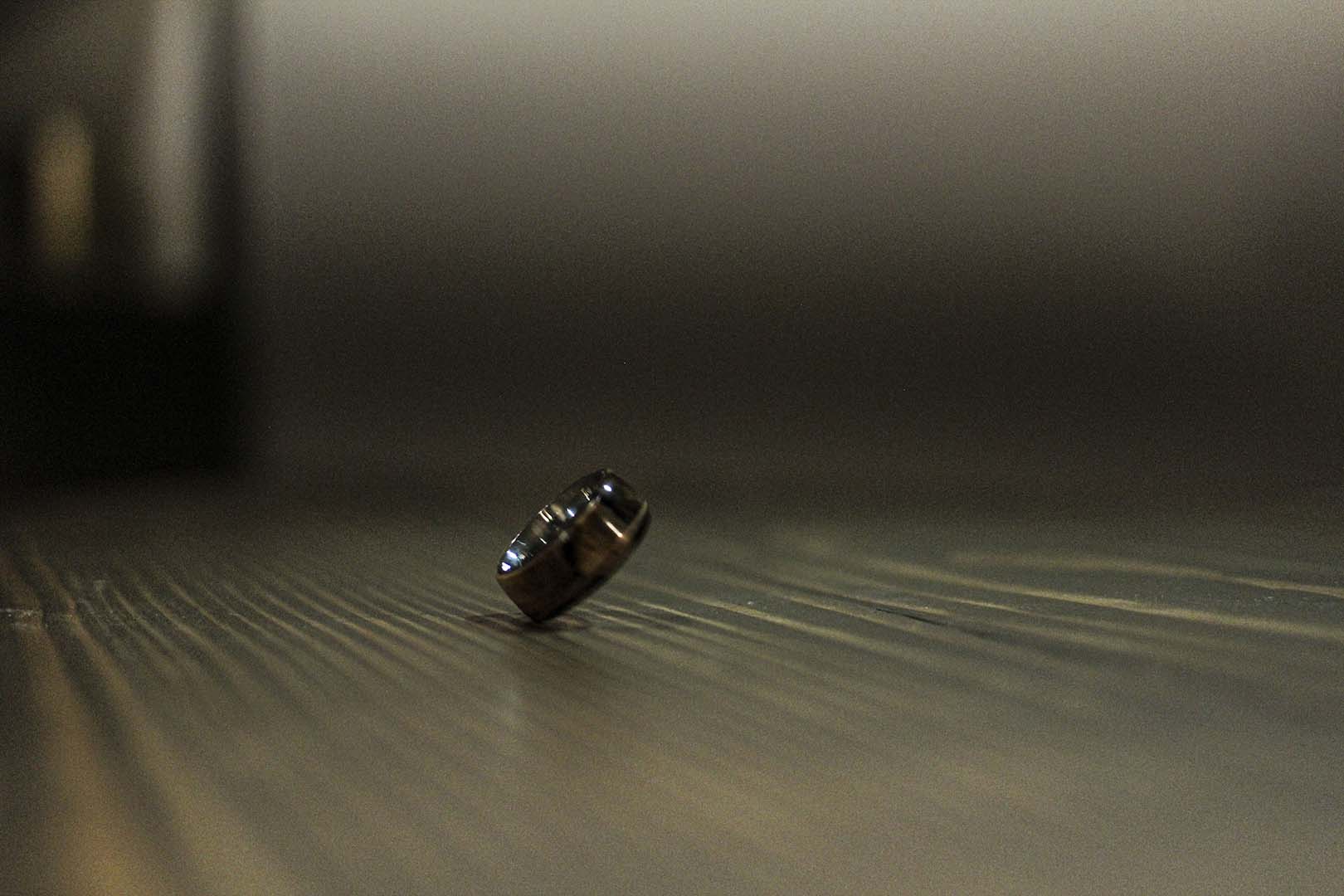
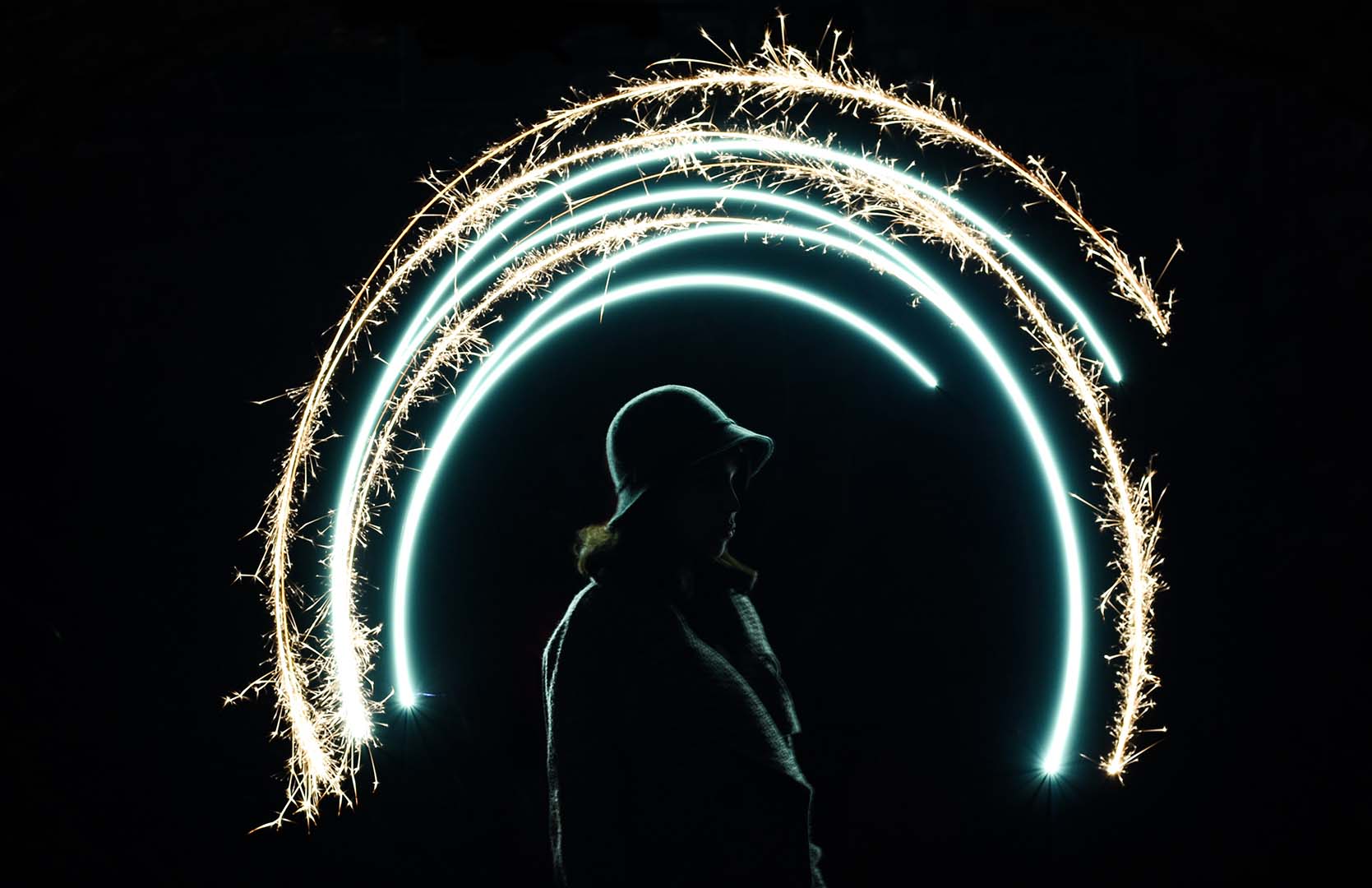
– 45 DEGREE ANGLE: While capturing this image I had a hard time keeping my ISO low due to lighting but I was able to find the angle of this spinning ring that I was hoping for. To create this image I used a fairly fast shutter speed. In post, I darkened the shadows but increased my clarity and texture so the ring would stand out more.
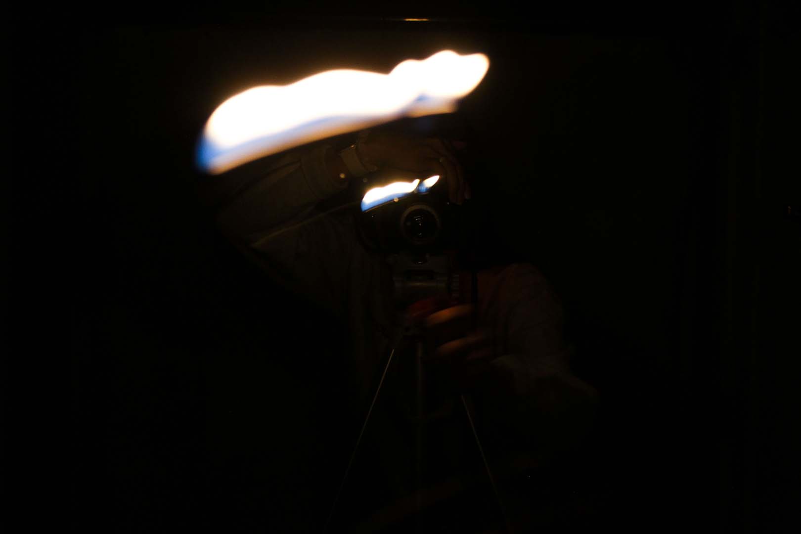
– LEADING LIGHT: When taking this image I wanted to experiment with a smaller and more focused light source, so I used a lighter but then stood in front of a mirror which helped caused to streaks of light. In order to keep the light in the shot longer I used a slow shutter speed of 1/4. In post I darkened the shadows to help keep more of the focus on the light.
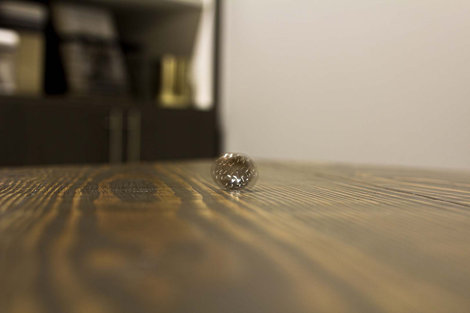
– BLURRED RINGS: In this image I used the ring again but instead made it blurry this time. Again, I was struggling with my lighting so I used a higher ISO but compensated for it by keeping my camera stable on the table. In order to get the blur like I had hoped, I used a slower shutter speed of 1/5 and a wider aperture of f/2.8. In post, I made the colors warmer to help make the ring feel more apparent.
A Study in Aperture and Shutter Speed: This post will be demonstrating my research, study and findings on the topics of aperture and shutter speed that includes photographic examples of each point. Then followed by some info about a photography or editing topic that interests me to explore more about. Enjoy!
Through my research I was able to learn more about the topic of wide aperture. When we have a wide aperture that means that our “f-stop” is a larger fraction such as f/2 or think of it as 1/2. Meaning that our lens is only opening 1/2 of the way, this allows for a greater quantity of light flooding into the lens of your camera. Therefore, producing a more shallow depth of field. As we gather more light by having a wider aperture this causes a smaller area of focus and creating a bokeh (background blur). This technique is great for close up shots and creating focal points.
Now that we have learned about one part of aperture, the wide aperture, we will now focus on the other aspect, narrow aperture. When we have narrow aperture that means that our “f-stop” is a smaller fraction like f/16 or f/22, meaning the lens of our camera is only opening a 1/16 or 1/22 of the way, creating a very small opening. By having a small opening in our lens we cannot have the same amount of light reach the lens as if it was all the way open or even half of the way. With this smaller amount of light allotted, we can have a larger area in focus in our image, where everything is sharp. This technique works best for shots like landscapes or even city streets like featured above.
Fast shutter speed is also known as “Frozen Motion”. Shutter speed actually refers to how long your lens stays open when taking a photo on your camera and is also measured by fractions just like aperture, so something like 1/x equals the speed at which the shutter curtain will open and close. For example anything around 1/500 will open and close the shutter curtain very quickly, and by setting it to this speed you can capture moving objects or people as if they were frozen. Something to keep in mind is that since the shutter curtain is moving at such a high speed very little light is able to be gathered by the lens, so you will need plenty of light around you. Another thing to note is that since you are at a faster shutter speed, tripods are not always necessary for the shot.
Just like the name, slow shutter speed is the exact opposite of fast shutter speed. Slow shutter speed is also known as blurred motion. Unlike the fast shutter speed we want our fraction to be much larger such as 1/60 or anything less than that, because that means our lens will be shutting at the speed of 1/60 of a second rather than 1/500 of a second. In our images we want to make sure that our subjects that are moving are blurred but anything else such as the background or surrounding objects to be still, so be sure to use a tripod to reduce any shaking. Since our lens will be opened for longer we have to take into account the large quantity of light captured, to avoid your image from being overexposed try shooting in darker areas or darker times of the day.
PHOTOGRAPHY OR EDITING TOPIC I AM INTERESTED IN – BRACKETING:
After doing some research and browsing around a topic that stood out to me that I want to learn about and put into use is bracketing. Bracketing involves in camera (the photography stage) and in post (the editing stage), this technique allows you to find the right exposure for your image. Generally you take 3 photos (sometimes 4), one is underexposed, the next is normal exposed and then one overexposed. The exposure can be changed by changing your shutter speed to accommodate the amount of light. Then with these three images you can pick and choose which parts of the 3 images you want to blend, this can be done using photoshop.
The focus of this project is to Reverse Engineer any advertisement, meaning analyzing certain design aspects and principles such as contrast, repetition, alignment, proximity and color. After doing so, analyze the same design aspects in the new advertisement created to fit in the same campaign as the original.
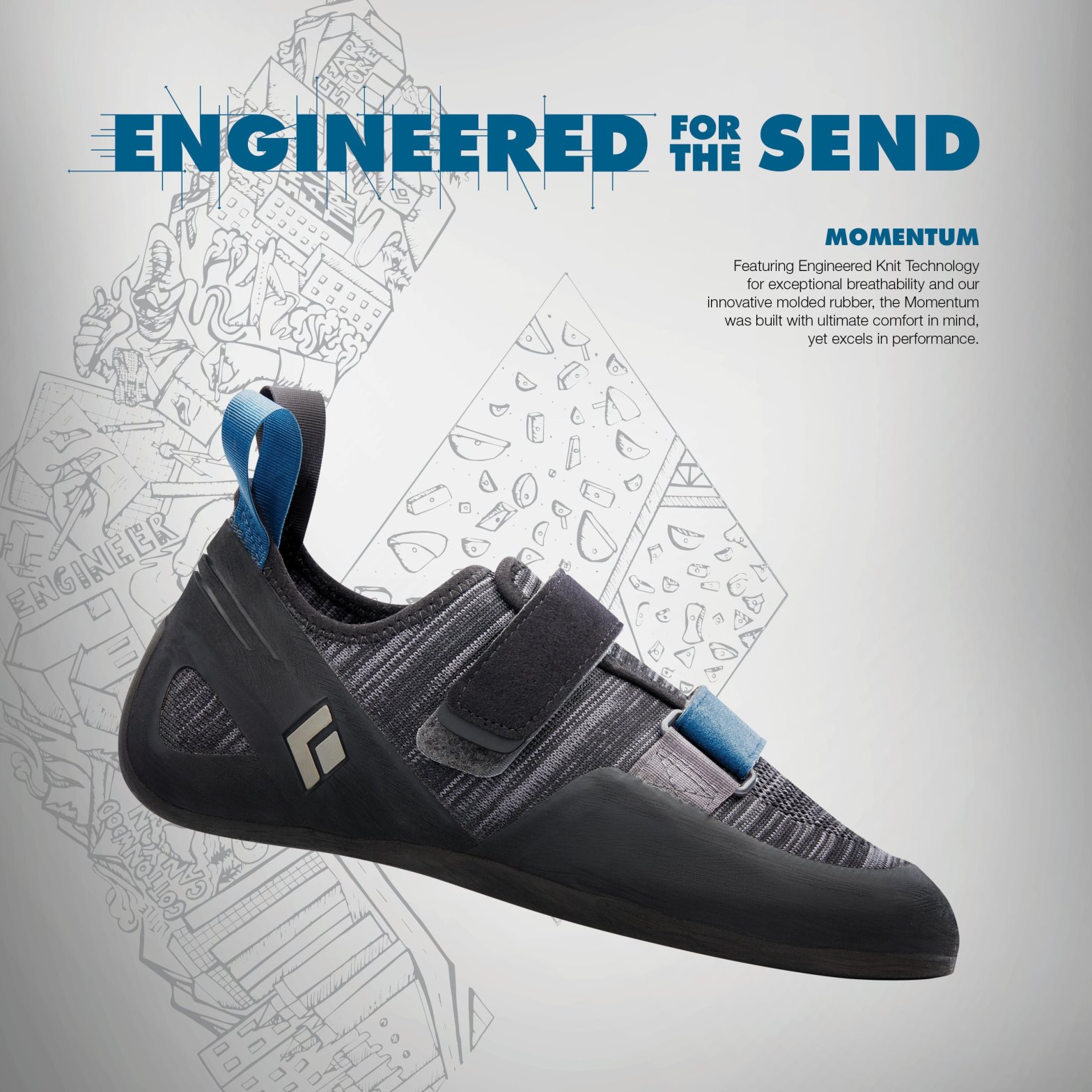
This advertisement is a targeted campaign for Black Diamond (Rock Climbing/Outdoor Equipment & Apparel Company) and their new line of Momentum Climbing shoes. The designer is unknown but can be found on the Ascent Outdoors website under their News page. https://ascentoutdoors.com/blogs/news/black-diamond-climbing-shoes
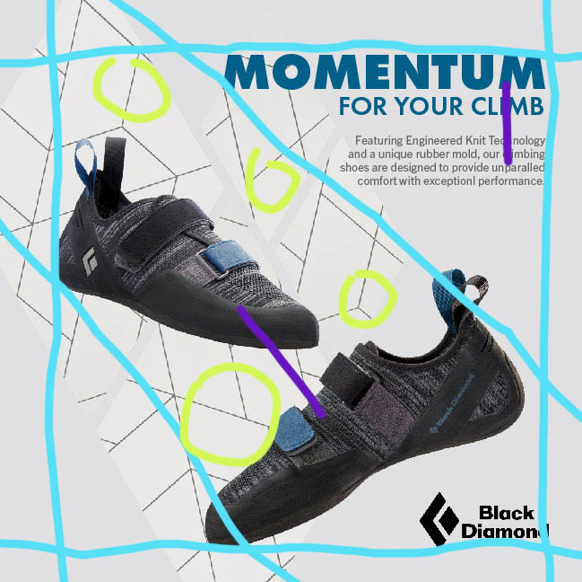
Original Ad Analysis – Design
In this original Black Diamond climbing shoe advertisement we can see that there were multiple design principles used throughout to enhance their message and design.
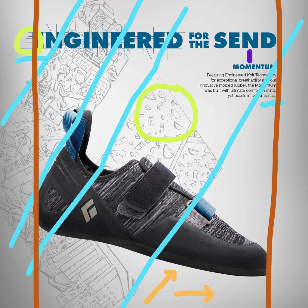
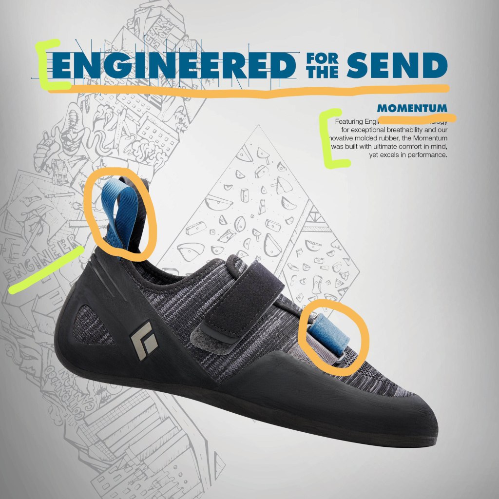
Shown in orange, the arrows at the bottom of the image shows the contrast between the the main image, the shoe, and the background which is a lighter gray with a gradient. Then in the green circles we can recognize the repetition within the design, in the type there are multiple areas of lines coming off of it, then in the background there is repetition in the holds of the rock wall sketch. Then alignment is demonstrated with he blue lines, where the background images aligns with the shoe image in the front keeping everything flow visually. Another use of alignment can be seen in the dark orange/red lines on either side keeping the text and the shoe in the center of the page. Finally we can see that there is proximity in the placement of the text, shown in purple.
Original Ad Analysis – Color & Typography
Other aspects of design include color and typography, in this design we can see that both aspects were utilized. In the orange we can see that the same blue shades/family were used in the text and in the shoe, these accents of blue really stand out compared to the neutral background and black shoe. Then for the typography we can see this in the green strokes above, the text is very block like and bold just like rocks would be, using serif fonts to show that. Then we can see that the text was also captured in the background image on the left, shown those block letter once again.
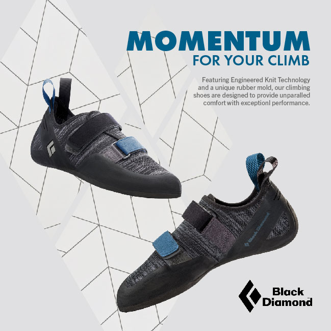
Black Diamond – New Advertisement
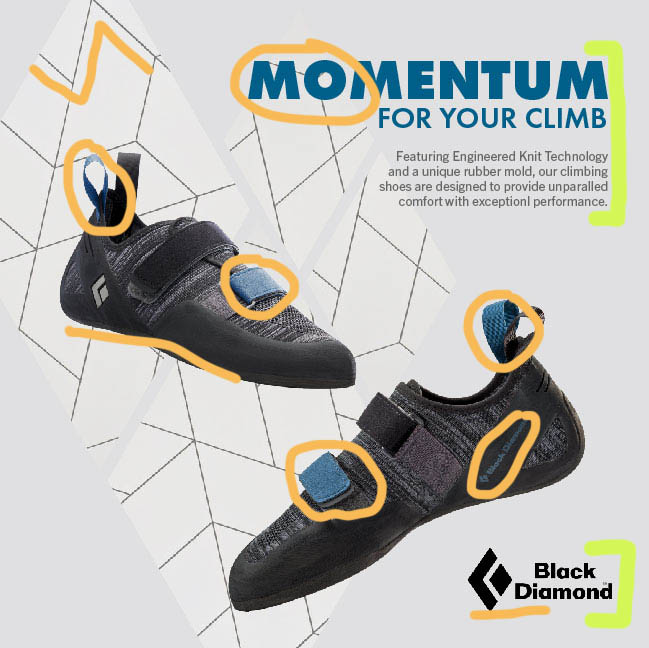
New Ad Analysis – Design
More of the same design principles can be found in this new ad as in the original. In the blue lines we can see the vertical and horizontal blue lines that show a consistent boarder as well as the diagonal lines keeping the shoes and logo in line. The green circles help us see the repetition of the background, through its lines and the diamond shapes, which the diamonds can also be seen in the logos. Finally proximity can be seen in purple,
New Ad Analysis – Color & Typography
In the newly created ad, we can see the same color scheme used and in a way to create unity between the type and the shoes (shown in the orange circles), keeping it minimalistic. Then we can see more color through the black logo and the black geometric lines (shown by the orange lines). In the green brackets we can again see the same block letters as in the original advertisement.
Black Diamond – The Wrap-up
These advertisement makes great use of all the listed design principles; contrast, repetition, alignment, proximity and color. By focusing on multiple design principles they are able to keep the viewers eyes moving across the image, without feeling overwhelmed or confused. The ads have a cohesive color scheme to help you recognize that they are for he same campaign, as well as the same text to help it be easily recognizable again. The designers concept is clearly portrayed, showing how their new Momentum shoes are sleek but ready for the climb.
The focus of this project is to Reverse Engineer any advertisement, meaning analyzing certain design aspects and principles such as typography and photography.
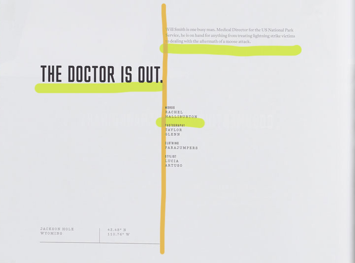
The are multiple categories of typefaces represented in this design spread. The category of typeface underlined in orange would be considered a Sans Serif Type Style, specifically “Square”. This type can be identified through its grotesque character traits and proportions, dramatic squaring of normally curved strokes. As well as the more latitude in character, which tend to be limited to display designs like above. Some fonts of the Sans Serif Type Style – Square can include Cachet and Neo Sans.
The category typeface underlines in green can be identified as a Serif Type Style, more distinctly as “Traditional Serifs”. Some indicators of the traditional serifs are the finer character strokes, which can be reproduced and have a subtler character shape to be maintained. The axis of curve strokes can be inclined in transitional designs, and the strokes have a vertical stress. Some fonts of the Serif Type Style – Traditional Serif can include Baskerville and Perpetua.
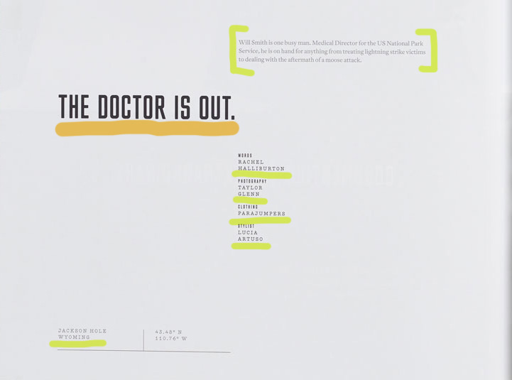
Design Spread – Contrast of Typefaces
In this design spread we can see the contrast between the fonts on the page through the different strokes of each section of type (illustrated in green above). This allows for certain text to stand out first which creates visual hierarchy for the viewer, something that supports this idea is the point size of the type because it elevates the strokes. An additional way that the typefaces are contrasted with one another are where they are placed on the page (illustrated in orange above). There is a distinct line that separates the different text on the page through the design principle of alignment, creating a certain flow.
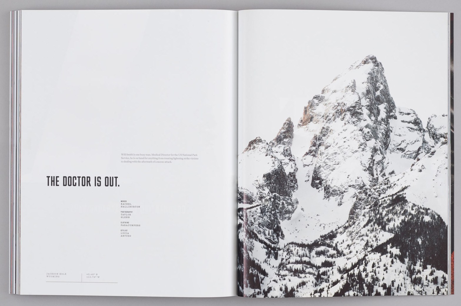
Design Spread – Photography Utilization
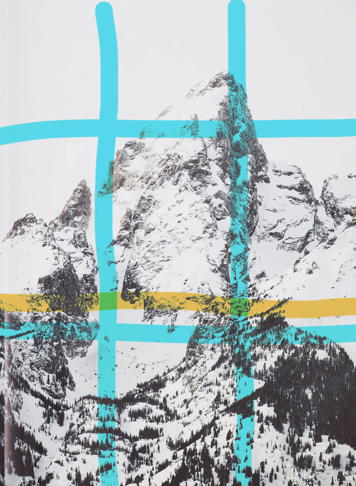
In this image used in the design spread we can see that there is a clear-cut focal point, but there is so much more going on in this photo. The photographer of the photo applied the rule of thirds by making the peak on the mountain in the top right corner of where the lines intersect, which is highlighted with the blue lines above. Then there is a definite leading line highlighted in orange above, this is where the tree line stops, and where the color change occurs causing more white from snow to show since there is no more trees adding contrast.
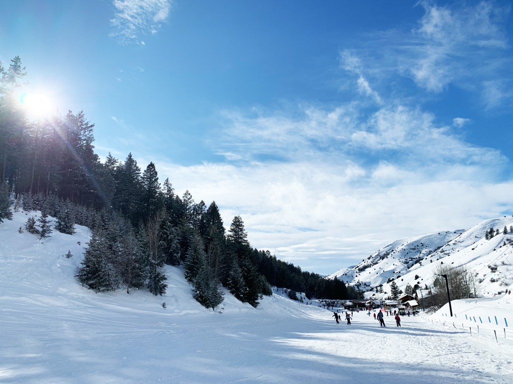
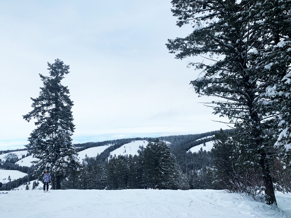
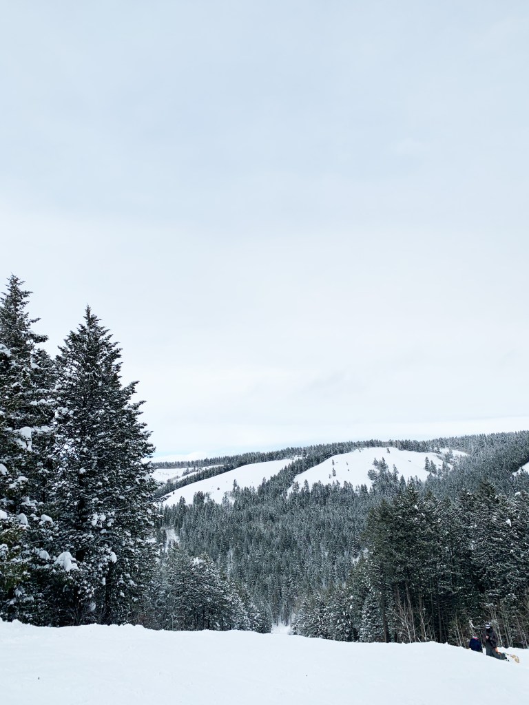
Design Spread – New Photography
My three images that I took were at Kelly Canyon Ski Resort, and have a similar feel to the photo used in the design spread by Taylor Glenn. These images use consistent colors and environment, but more importantly they follow the rule of thirds. In the first image where the tree line and the mountain side on the right meet is at an intersection of the third lines, this idea also goes for the other two pictures but where the main trees are. Then all three images utilize leading lines, primarily where the ridges meet the skyline, and where the standalone trees are showing in the skyline.
Design Spread – The Final Cover
This magazine design spread created by designer Taylor Glenn for Issue 6 of Avaunt Magazine, has optimal use of the different categories of typefaces through using more than one and then contrasting them with one another by placement on the page, stroke thickness as well as point size, which are all contributing factors. All of these concepts were executed in a sleek manner, because nothing feels crowded, awkward or out of place making the design appealing to the eye. By adding the photo on the other page it gives it a dramatic feel especially because the image is elevated through the great use of the Rule of Thirds and Leading Lines.
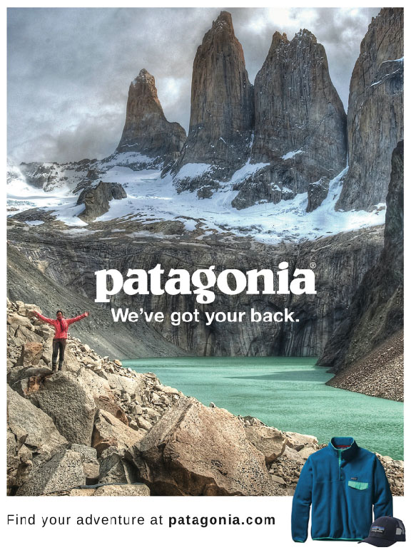
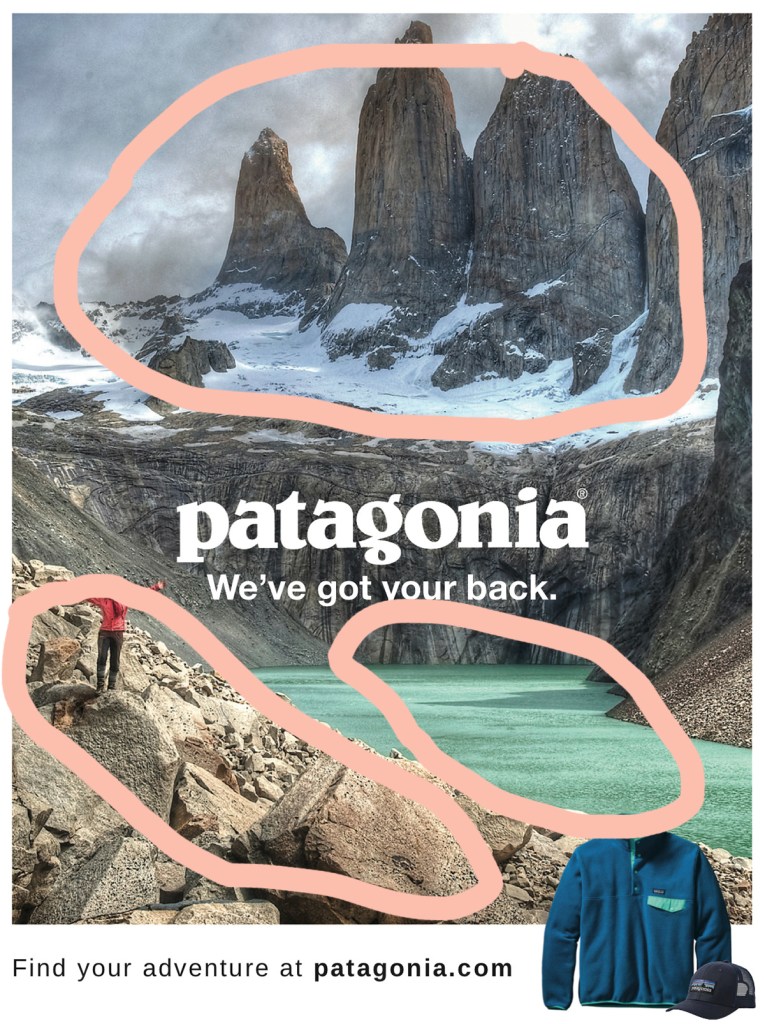
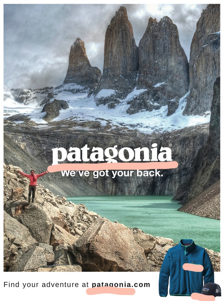
The focus of this project is to Reverse Engineer any advertisement, meaning analyzing certain design aspects and principles such as contrast, repetition, alignment, proximity and color.
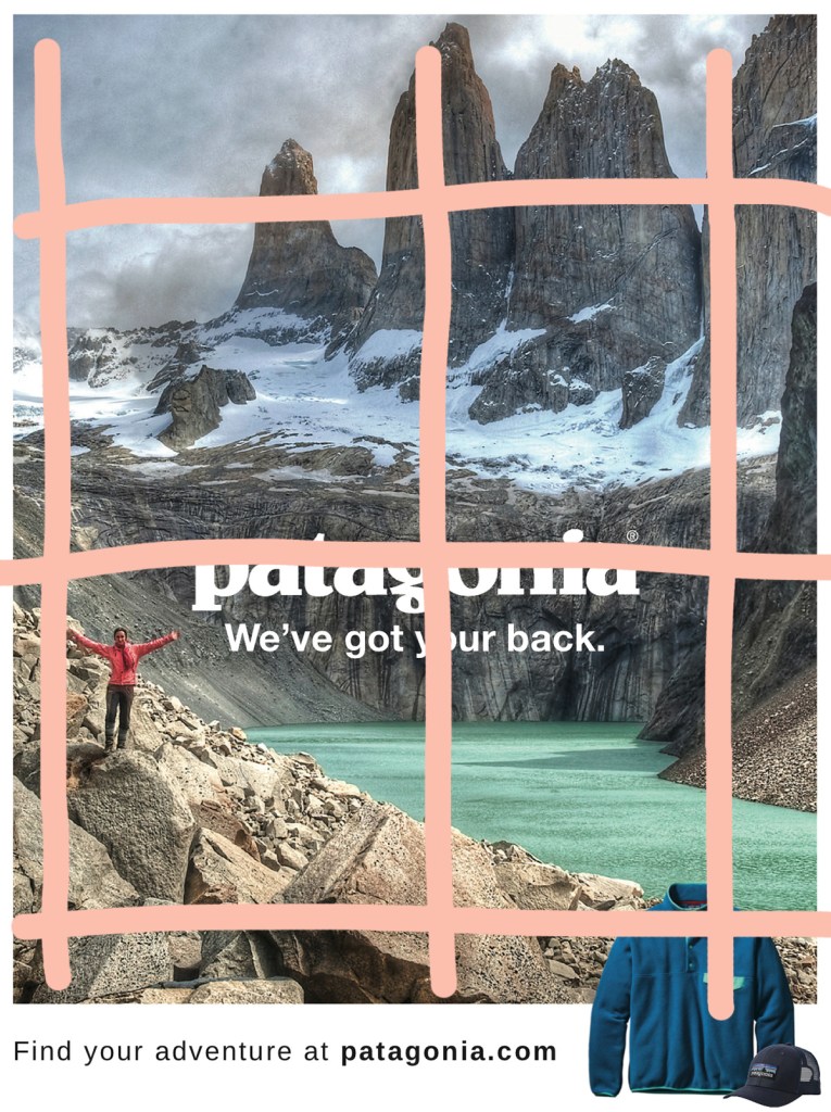
In this advertisement the designer uses the landscape in the picture to depict the design principle of contrast, which helps move your eyes around the whole poster because there are not only color differences between the highlighted areas but in texture as well. Using this design principle really helps show the different aspects of nature and adventure that they want their customers to explore in their clothing and apparel.
Patagonia – Repetition
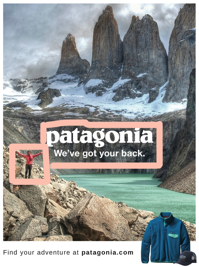
In this poster there is a lot of repetition used with their company name. Their name is not only used as text but also on their appeal in the corner as well. By having their name take up most of the text, the designer can make a closer association of their company with the outdoors.
Patagonia – Alignment
This advertisement has great use of alignment by breaking up the picture into three main sections both vertically and horizontally. Vertically we can see that the person, their name and tagline, and then their apparel are are the main points, which keeps the focus on their brand. Horizontally there is the use of the scenery with the mountain peak up top, their brand in the center, and the rocks down below, while the bottom portion ties everything together.
Patagonia – Proximity
Proximity is used in this picture by placing the brand name and tagline next to the person, this helps represent that the clothes the individual is wearing are the Patagonia apparel. Another use of proximity is the person is standing where the brand, water, rocks and mountains all meet, showing that they can cover all aspects of adventure and the outdoors.
Patagonia – Color
Color plays a big role in this design because the scenery has neutral colors for the most part, and the text is only displayed in white or black. The main pops of color come from their product and apparel. The use of color is also not concentrated in a single section, which helps represent how you can take the clothes anywhere.
Patagonia – The Wrap-Up
This advertisement makes great use of all the listed design principles; contrast, repetition, alignment, proximity and color. By focusing on multiple design principles they are able to keep the viewers eyes moving across the image, without feeling overwhelmed or confused. The designers concept is clearly portrayed, showing how their apparel can be taken anywhere and that you can rely on them to take the adventures you want in the way you want.